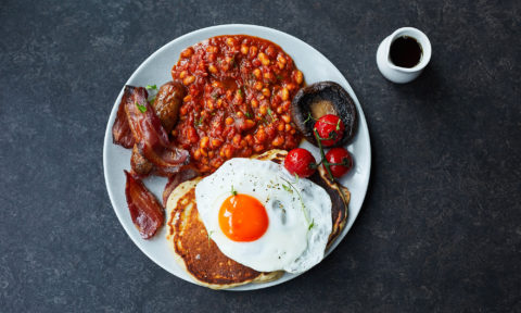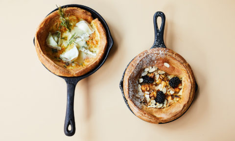
Savoury and sweet pancakes to comfort the soul.

In short
Where the Pancakes Are started out in 2015 with the single purpose to become the No.1 destination for pancakes. At the beginning of 2021, they can modestly say that’s the case.
Project information
We created a new visual identity for WTPA, working closely with the founder and the architect’s team Overtreders W.
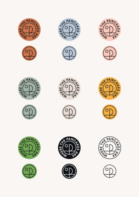
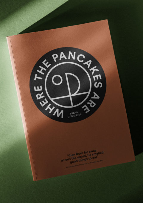
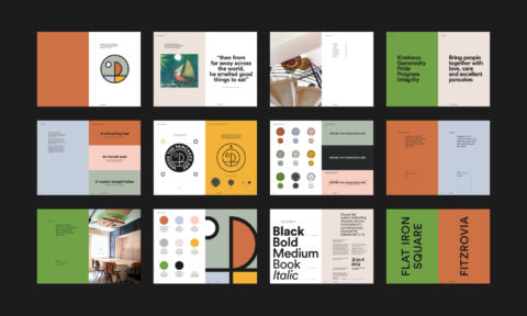
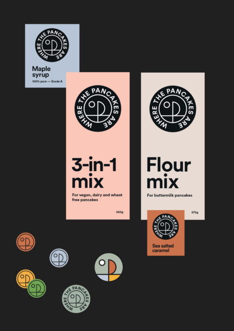
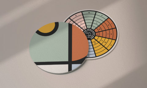
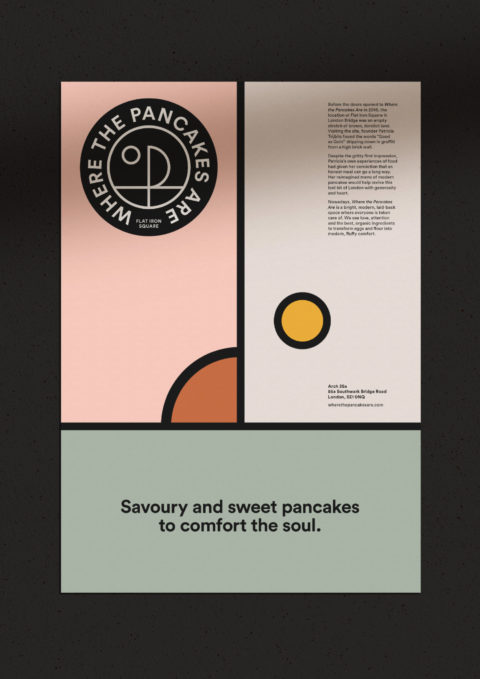
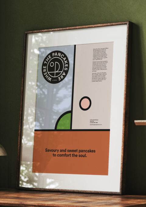
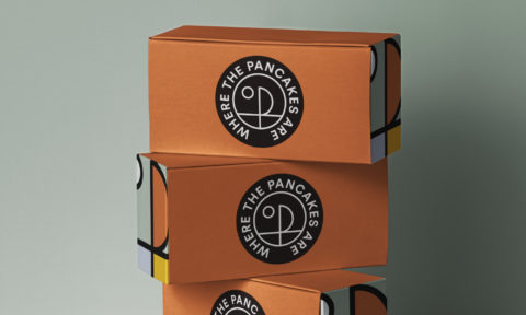
The overarching aim was for WTPA to have a clear identity that brings together its beliefs, its products and all the people that the company connects with. To be recognisable and truthful. To be adaptable and playful. We give no prizes for guessing where the name derived from. We explored the book for its adventure, taking particular joy from the boat scene. This was a starting point for a ‘P’ that forms the centre of the roundel. A simple, timeless stamp that can be applied with ease across restaurants, retail and social.
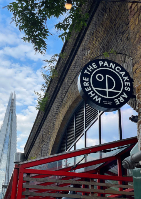
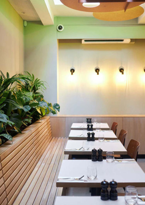
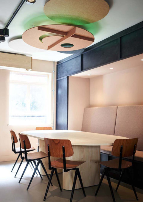
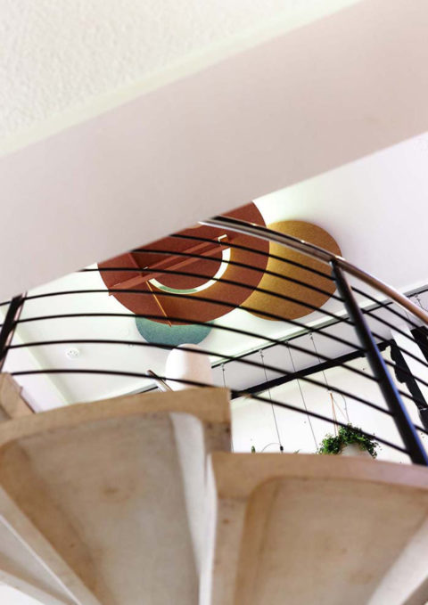
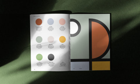
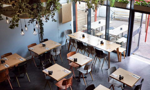
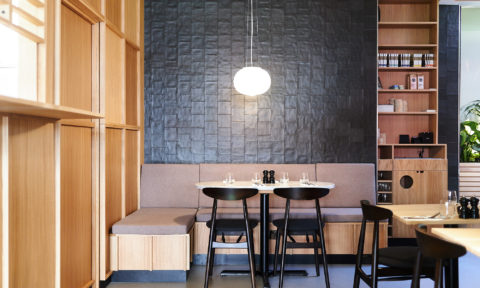
The logo was then beautifully applied to the ceilings of the new Fitzrovia restaurant. The colours and shapes seamlessly work throughout both locations including the first one situated in London Bridge under the arches at Flat Iron Square
Where the Pancakes Are started out in 2015 with the single purpose to become the No.1 destination for pancakes. At the beginning of 2021, they can modestly say that’s the case.
Scope of work
Workshop
Visual identity
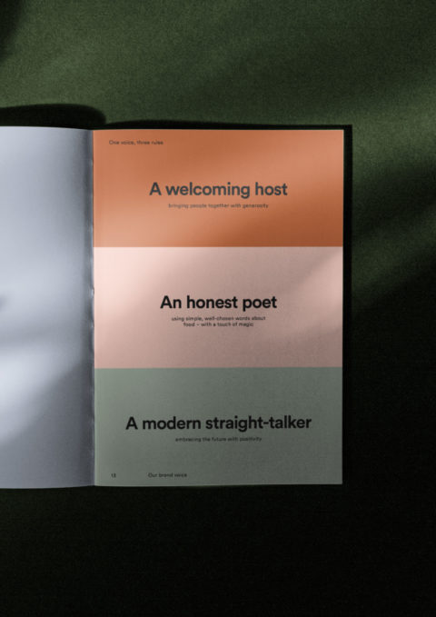
Brand guidelines
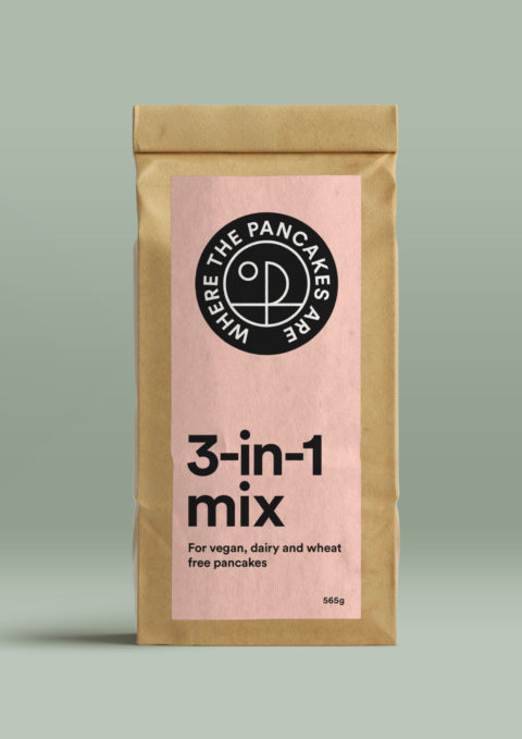
Packaging
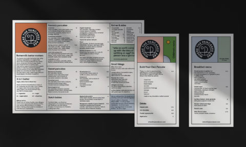
Templates
Credits
Interiors: Overtreders W
Photos: Safia Shakarchi
